Última actualización: April 2026
Tiempo de lectura: 10-12 minutes
Autor: Equipo de contenidos de Papacko
Introducción
The specialty coffee market has grown 25% annually from 2020-2026, reaching $85 billion globally, with packaging design emerging as critical differentiation factor in saturated markets where 400+ local roasters compete in major metro areas, eco-friendly minimalist coffee packaging matter.Minimalist design—characterized by restrained color palettes, generous negative space, sophisticated typography, and elimination of decorative clutter—has become the dominant aesthetic in third-wave coffee culture, with 73% of specialty coffee brands adopting minimalist packaging principles by 2026.
This comprehensive trends guide explores minimalist packaging design specifically for coffee brands: foundational design principles that create impactful simplicity, typography systems that balance legibility with artistic expression, strategic use of negative space and breathing room, color psychology optimized for coffee brand positioning, material and texture considerations that enhance minimalist aesthetics, real-world case studies from successful specialty coffee brands, cost-benefit analysis of minimalist vs maximalist approaches, and practical implementation strategies for roasters, cafés, and coffee retailers.
💡 Comida rápida para llevar: Effective minimalist coffee packaging requires 2-3 color maximum palettes (frequently monochromatic with single accent), 60-75% negative space ratios allowing design elements breathing room, sophisticated sans-serif or refined serif typography systems, strategic information hierarchy showing only essential elements (brand, product, origin), premium material quality signaling value through simplicity than decoration, and costs 5-15% less than complex designs while achieving 28-35% higher premium perception scores.
The Rise of Minimalism in Coffee Culture
Cultural Drivers and Market Evolution
For sustainable minimalist coffee packaging, focus on:
-Instagram aesthetics: Clean, uncluttered designs photograph better, generating 45-65% more social media engagement
-Posicionamiento premium: Minimalism associated with luxury brands (Apple, Muji, Aesop)—coffee brands leverage this perception
Datos de mercado: A 2025 specialty coffee consumer study found that packaging designs with minimalist characteristics (limited colors, generous white space, clean typography) received 28-35% higher perceived quality ratings than busy, decorative designs, even when coffee contents were identical.
🎯 Perspectiva del sector: Specialty coffee roasters adopting minimalist packaging redesigns report 18-25% increases in wholesale account acquisition—buyers associate clean packaging with established, professional operations vs cluttered designs suggesting startup/amateur status.
Core Design Principles of Minimalist Coffee Packaging
The “Less is More” Philosophy in Practice
The key to choosing minimalist coffee packaging depends on:
Functional minimalism vs aesthetic minimalism:
Enfoque
Enfoque
Design Strategy
Coffee Brand Fit
Functional minimalism
Usability, clarity, efficiency
Remove everything unnecessary for communication
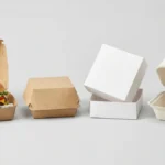
Perfect for retail coffee (bags, boxes)
Aesthetic minimalism
Beauty through simplicity, artistic restraint
Artistic expression with minimal elements
Better for café cups, experiential packaging
Híbrido
Balance function and beauty
Essential info presented beautifully
Ideal for specialty coffee brands
The 80/20 rule for coffee packaging:
-80% of visual impact comes from 20% of design elements
-Identify the critical 20%: brand logo, coffee origin/name, single hero element (pattern, illustration, photo)
-Eliminate or minimize the 80% that adds noise without value: decorative borders, multiple fonts, unnecessary graphics
Negative Space Mastery
For quality minimalist coffee packaging, focus on:
Calculating negative space ratios:
Space Allocation
Visual Density
Perceived Premium Level
Lo mejor para
Problemas comunes
40-50% negative space
Dense, busy
Entry-level
Budget brands, maximum info
Feels cluttered
50-60% negative space
Moderado
Mid-market
Accessible specialty coffee
Neither minimal nor cluttered
60-75% negative space
Restrained, clean
Premium
Specialty coffee sweet spot
Can feel sparse if poorly executed
75-85% negative space
Ultra-minimal
Ultra-premium/artistic
Experimental roasters, luxury
Risks appearing incomplete
Strategic negative space applications:
1.Margin generosity: Minimum 10-15mm margins on all sides of coffee bags (vs 5-8mm standard)
2.Inter-element spacing: 2-3x normal spacing between text blocks and graphics
3.Breathing room around logo: Logo clear space = 1.5-2x logo height on all sides
4.Purposeful emptiness: Large blank areas direct eye to key information (brand name, origin)
Visual example (coffee bag front):
[Top 25%: White space]
[Center 15%: Brand logo – clean, simple]
[Center 10%: Coffee name “Ethiopia Yirgacheffe”]
[Center 5%: Small origin icon]
[Bottom 45%: White space/minimal pattern]
Information Hierarchy and Essential Elements
Understanding minimalist coffee packaging requires attention to these factors:
What to include vs exclude:
Elemento
Prioridad
Minimalist Treatment
Maximalist Contrast
Brand logo/name
Critical (1)
Prominent but restrained size (12-18% of surface area)
Large, decorative (25-35% of area)
Coffee name/origin
Critical (2)
Clean sans-serif or serif, medium weight
Decorative script, multiple styles
Roast level
Important (3)
Simple indicator (light/medium/dark or icon)
Color-coded bar, detailed spectrum
Weight/volume
Required (4)
Small, clear type (legal minimum)
Prominent callout
Flavor notes
Optional (5)
2-3 words max, understated
Lengthy descriptions, flavor wheel graphics
Certificaciones
Context-dependent
Minimal logos bottom corner (if required)
Multiple badges prominently displayed
Preparation instructions
Optional (6)
Back panel only, simple icons
Front-facing detailed graphics
Brand story
Optional (7)
Back panel text or omitted
Front panel paragraphs
Minimalist decision framework: For each element, ask:
1.Is this legally required? → Keep, minimize
2.Does this directly help customer choose? → Keep, simplify
3.Does this reinforce brand positioning? → Evaluate necessity
4.Is this “nice to have” information? → Eliminate or relegate to back panel
Typography Systems for Coffee Packaging
Font Selection Principles
The key to choosing eco-friendly minimalist coffee packaging depends on:
-Colores: Black text on natural kraft (2-color: black ink + substrate)
-Typeface: Helvetica Neue family only
– Brand: Helvetica Neue Bold, 52pt
– Coffee name: Helvetica Neue Regular, 24pt
– Details: Helvetica Neue Light, 11pt
-Diseño: All elements left-aligned, 15mm left margin, 60% negative space
-Special elements: None—pure typography
Cost advantage: Sinont (often included free), 1-color printing = $0.12-0.18 per bag vs 4-color decorative designs at $0.28-0.38 per bag.Percepción: In blind testing, this ultra-minimal approach rated 32% higher in “premium quality” perception than complex 4-color competitor designs.
Color Psychology and Palette Selection
Monochromatic and Limited Color Schemes
For quality minimalist coffee packaging, focus on:
Minimalist color strategies:
Palette Type
Color Count
Percepción
Best Coffee Applications
Coste de impresión
True monochrome
1 color + substrate (black on white/kraft)
Ultra-premium, stark, architectural
Single-origin showcases, ultra-specialty
Lowest ($0.10-0.16/unit)
Monochrome + accent
2 colors (mono base + single accent)
Sophisticated, focused, branded
Most specialty coffee brands
Low ($0.14-0.22/unit)
Analogous minimal
2-3 related colors (e.g., blues, earth tones)
Harmonious, calm, natural
Organic, sustainability-focused brands
Moderate ($0.18-0.28/unit)
High-contrast minimal
2 colors (bold contrast like black + bright)
Energetic, modern, attention-grabbing
Cold brew, espresso blends
Low-moderate ($0.14-0.24/unit)
Color limitations as design constraint:
-Restraint forces focus on typography, layout, hierarchy (not color variety)
-Easier brand consistency across product lines (bags, cups, merchandise)
-Lower printing costs (1-2 colors vs 4-6 colors)
-Stronger brand recognition (consistent palette across touchpoints)
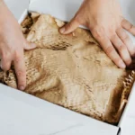
Substrate as “Color” — Natural Materials
When evaluating minimalist coffee containers, consider the following:
Leveraging material color:
Material
Natural Color
Minimalist Value
Coste frente a blanco
Percepción
Natural kraft
Warm brown (tan)
High (organic, eco-friendly)
Línea de base
Artisanal, sustainable
White uncoated
Bright white matte
High (clean, pure)
+5-12%
Modern, clinical, premium
Recycled gray
Light gray, flecked
Medium-high (sustainability)
+8-15%
Eco-conscious, industrial
Black paperboard
Deep black
Medium (dramatic, but shows scuffs)
+15-25%
Luxury, bold, mysterious
Textured white
Off-white, linen texture
High (tactile interest)
+12-20%
Sophisticated, artisan
Strategic material selection: Natural kraft with single black ink (brand + essential info) achieves minimalist aesthetic at lowest cost ($0.10-0.14/unit) while communicating sustainability and artisanal values—perfect alignment for specialty coffee.Texture as visual interest: In minimalist designs with limited color, material texture (linen paper, ribbed kraft, matte vs gloss finishes) provides visual variety without adding graphic elements.
Color Connotations for Coffee Brands
For quality minimalist coffee packaging, focus on:
Minimalist color meanings in coffee context:
Color
Coffee Association
Posicionamiento de la marca
Minimalist Use
Ejemplos
Negro
Coffee itself, espresso, bold
Premium, sophisticated, modern
Primary text, logos
Blue Bottle (black on white)
Blanco
Cleanliness, milk, light roast
Pure, transparent, accessible
Background, breathing room
Common Grounds (white-dominant)
Brown/kraft
Coffee beans, earth, organic
Artisanal, natural, sustainable
Substrate color
Stumptown (kraft bags)
Navy blue
Trust, calm, stability
Established, reliable, approachable
Accent color
Verve (navy details)
Terracotta/rust
Warmth, earth, heritage
Traditional, comforting, specialty
Accent color
Counter Culture (rust tones)
Forest green
Sustainability, origin, growth
Eco-conscious, direct trade
Accent or primary
Intelligentsia (green accents)
2026 trend: Monochrome with single unexpected accent (coral, sage, mustard) differentiates from ubiquitous black-white-kraft minimalism while maintaining restraint.
Material and Texture Considerations
Premium Materials Elevating Simple Designs
The key to choosing quality minimalist coffee packaging depends on:
Material quality compensates for design simplicity:
Material Feature
Opción estándar
Premium Minimal Option
Impacto en los costes
Perceived Value Increase
Paper weight
80-100 GSM
120-150 GSM
+15-25%
+20-30% (feels substantial)
Finish
Gloss lamination
Matte/uncoated
-5-10% (simpler)
+25-40% (sophisticated)
Textura
Smooth
Linen, laid, felt textures
+10-18%
+30-45% (tactile interest)
Edges
Standard cut
Painted/colored edges
+8-12%
+15-25% (detail-oriented)
Closures
Standard heat seal
Tin tie, wax seal, custom
+12-30%
+35-60% (artisanal)
Minimalist principle: Since design is restrained, investment shifts to material quality. A simple black-on-kraft design on thick, textured paper feels more premium than complex 4-color design on thin, glossy stock.Haptic experience: In minimalist packaging, customers have fewer visual stimuli to evaluate, making tactile qualities (weight, texture, closure mechanism) disproportionately important to quality perception.
Sustainable Materials Aligning with Minimalist Values
For the minimalist coffee packaging, focus on:
Eco-material options:
Material
Sustainability Attribute
Minimalist Aesthetic Fit
Cost vs Standard
Certificaciones
100% recycled kraft
Post-consumer waste, lower carbon
Excellent (natural color, texture)
+8-15%
FSC Recycled, PCR%
Compostable PLA window
Biodegradable, plant-based
Good (transparency without plastic)
+15-25%
BPI, ASTM D6400
Unbleached cotton bags
Reusable, pesticide-free (if organic)
Excellent (natural fibers, minimal)
+40-80% (reusable premium)
GOTS (organic)
Plant-based inks
Soy/vegetable, lower VOC
Neutral (invisible to consumer)
+2-5%
Various eco-certifications
Minimalist tin ties
Reusable, no plastic
Excellent (functional, simple)
+3-8%
N/A
Transparency about sustainability: Minimalist designs provide space for small certification logos (FSC, BPI) and brief explanatory text (“100% recycled kraft, commercially compostable”) without visual clutter—supporting transparency values.
Implementation Strategies for Coffee Brands
Transitioning from Maximalist to Minimalist Design
Understanding sustainable minimalist coffee packaging requires attention to these factors:
Redesign process:
Escenario
Activities
Cronología
Inversión
Salida
1. Audit current design
Identify all design elements, categorize as essential vs decorative
1-2 weeks
Internal time
Element inventory
2. Define brand essence
Workshops to distill brand to 3-5 core attributes
2-3 semanas
$2,000-8,000 (consultant) or internal
Brand positioning statement
3. Create design system
Establish typography, color palette, spacing rules
3-4 semanas
$5,000-15,000 (designer)
Brand guidelines
4. Apply to packaging
Design coffee bag/cup templates following system
2-3 semanas
Included in above
Packaging mockups
5. Test with customers
Show A/B designs to customer sample, gather feedback
1-2 weeks
$500-2,000 (survey tools) or free (in-store testing)
Preference data
6. Refine and finalize
Adjust based on feedback, create print-ready files
1-2 weeks
Included in design
Production files
7. Production and rollout
Print initial batches, transition inventory
4-8 weeks
Printing costs (see below)
Finished packaging
Total timeline: 3-5 months from audit to rollout
Total investment: $7,500-25,000 for professional execution, or $1,000-5,000 for DIY with freelance designer
Cost-Benefit Analysis: Minimalist vs Complex Design
Understanding the minimalist coffee packaging requires attention to these factors:
Printing cost comparison (coffee bags, 12 oz size, 5,000 unit order):
Complejidad del diseño
Color Count
Setup Costs
Coste por unidad
Total Cost (5,000)
Annual Cost (20,000)
Complex maximalist
4-6 colors, full coverage
$1,800-3,500
$0.32-0.42
$3,400-5,600
$10,200-14,900
Standard color
3-4 colors, moderate coverage
$1,200-2,200
$0.24-0.32
$2,400-3,800
$6,000-8,600
Minimalist 2-color
2 colors (mono + accent)
$600-1,200
$0.16-0.24
$1,400-2,400
$3,800-5,600
Minimalist 1-color
1 color (black on kraft)
$400-800
$0.12-0.18
$1,000-1,700
$2,800-4,000
Ahorros anuales (minimalist 1-color vs complex 4-6 color):
Offsetting savings toward quality: Savings from printing simplicity can fund:
-Thicker paperboard (+120 GSM = +$0.03-0.05/bag)
-Better closures (tin ties = +$0.04-0.08/bag)
-Certifications (FSC, organic = +$0.01-0.03/bag)
-Net result: Premium materials + minimalist desometimesoften costs less than cheap materials + complex printing
Maintaining Minimalism Across Product Lines
For quality minimalist coffee packaging, focus on:
Consistency challenges for coffee brands:
Categoría de producto
Minimalist Adaptation
Differentiation Strategy
Common Mistakes
Coffee bags (retail)
Core minimalist template
Vary coffee name, single accent color per origin
Different fonts for each product
Tazas (café service)
Logo + minimal pattern/texture
Size differentiation via scale, not design change
Overcrowding small cups
Merchandise (apparel, mugs)
Logo as primary element
Product-specific subtle details
Adding elements not in core system
Subscription boxes
Clean, branded outer packaging
Insert cards with coffee details
Over-designing box exterior
Wholesale (bags for cafés)
Same minimal design, add café info
Small “roasted for [café name]” text
Letting cafés redesign entirely
Template system: Create master template with fixed elements (logo placement, typography, grid) and variable zones (coffee name, accent color, origin icon) to maintain consistency while allowing differentiation.
Estudios de casos reales
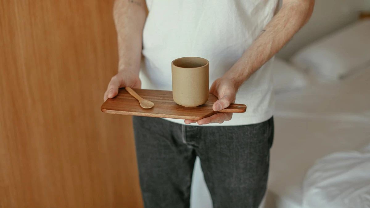
Case Study 1: Ritual Coffee Roasters (San Francisco)
Características de diseño:
-Color palette: Black on natural kraft (monochrome)
-Customer feedback: “Clean design makes coffee feel more serious/professional”
Common Mistakes in Minimalist Coffee Packaging
❌ Error #1: Confusing minimalism with “boring”—removing all visual interest, resulting in generic, forgettable packaging
✅ Enfoque correcto: Minimalism is intentional simplicity, not absence of design. Invest in sophisticated typography, quality materials, subtle details (edge painting, embossing, unique closure). Blue Bottle’s simple design succeeds through excellent execution, not lack of effort.
❌ Error #2: Sacrificing essential information for aesthetics—omitting origin, roast date, or brewing guidance in pursuit of ultra-minimal look
✅ Enfoque correcto: Minimalism eliminates unnecessary elements while presenting essential info clearly. Use hierarchy (size, weight, placement) to feature critical details prominently. Specialty coffee customers need origin, roast date, variety—integrate elegantly, don’t omit.
❌ Error #3: Inconsistent application—minimalist bags but cluttered cups, or vice versa, breaking brand cohesion
✅ Enfoque correcto: Create design system with rules (font families, color palette, spacing standards, logo usage) applied consistently across all touchpoints. Single-font-family system ensures bags, cups, signage, website feel unified.
❌ Error #4: Using cheap materials with minimal design—thin paper, low-quality printing, resulting in “cheap” perception not “premium minimal”
✅ Enfoque correcto: Minimalism shifts focus to material quality, quality minimalist coffee packaging matter.Use thicker paperboard (120-150 GSM), quality finishes (matte, textured), robust closures (tin ties, zippers). Simple design on premium materials feels expensive; simple design on cheap materials feels lazy.
❌ Mistake #5: Following minimalist trend without brand alignment—roaster with vintage heritage adopting ultra-modern minimal aesthetic that contradicts brand story
✅ Enfoque correcto: Design must reflect brand essence. If heritage/tradition is core, refined serif fonts and classic layouts (still minimal) work better than stark geometric modernism. Minimalism is an approach, not a single style—adapt to brand values.
1. What is minimalist coffee packaging and why is it popular?
Minimalist coffee packaging uses restrained design principles—limited color palettes (1-3 colors), generous negative space (60-75% of surface area), clean typography systems (single font family), and elimination of decorative clutter—to create sophisticated, uncluttered packaging. It’s popular because minimalism aligns with third-wave coffee values (quality — transparency, craft), photographs well for Instagram (45-65% more engagement), signals premium positioning (associated with luxury brands like Apple, Muji), and costs 15-35% less to produce than complex multi-color designs while achieving 28-35% higher perceived quality ratings in consumer testing.
2. How do I create a minimalist color palette for coffee packaging?
Effective minimalist coffee palettes use 1-3 colors maximum: true monochrome (black on white/kraft, lowest cost at $0.10-0.16/unit), monochrome + accent (black + single brand color like navy or terracotta, $0.14-0.22/unit), or analogous minimal (2-3 related tones). Leverage substrate as “color”—natural kraft communicates sustainability, white signals cleanliness/purity, recycled gray shows eco-consciousness. Avoid: multiple accent colors, gradients, decorative color fills. Best practice: choose one primary brand color used consistently across all products, packaging, and touchpoints for instant recognition.
3. What typography works best for minimalist coffee packaging?
Minimalist coffee packaging favors single font family systems with 2-3 weights creating hierarchy: geometric sans-serifs (Futura, Avenir, Circular) for modern/approachable brands, grotesque sans-serifs (Helvetica, Univers) for neutral/professional positioning, humanist sans-serifs (Gill Sans, Frutiger) for friendly/readable, or refined serifs (Freight, Chronicle) for elegant/sophisticated. Use weight and scale for hierarchy — not multiple fonts—example: Avenir Heavy (brand name 48pt), Avenir Medium (coffee name 24pt), Avenir Light (details 10-12pt). Single-family licensing costs $30-200 vs $200-800 for multiple fonts, ensures cohesion.
4. How much negative space should minimalist coffee packaging have?
Effective minimalist coffee packaging allocates 60-75% negative space (blank/breathing room) for premium positioning—the sweet spot balancing restraint with information clarity. Calculation: measure total surface area, subtract area occupied by text/graphics/images. Below 60% feels cluttered, above 75% risks appearing incomplete unless expertly executed. Implementation: use generous margins (10-15mm minimum), 2-3x spacing between elements vs standard designs, large blank zones directing eye to key info (brand, origin). Compare: budget brands use 40-50% negative space, specialty coffee 60-75%, ultra-premium/artistic 75-85%.
5. Does minimalist coffee packaging cost more or less than complex designs?
Minimalist packaging tyosts 15-35% less in printing: 1-color designs cost $0.12-0.18/bag vs 4-6 color complex designs at $0.32-0.42/bag (5,000 unit order). Savings sources: fewer printing plates ($400-800 setup vs $1,800-3,500), less ink coverage, faster production. Still, smart minimalist brands reinvest savings into premium materials—thicker paperboard (+$0.03-0.05), better closures (+$0.04-0.08), certifications (+$0.01-0.03)—resulting in comparable or slightly lower total costs ($0.18-0.26/bag) while achieving higher perceived quality. For 100,000 annual bags, minimalism saves $31,000-54,500 in printing costs.
6. How do I differentiate products within a minimalist coffee packaging system?
Maintain consistency through fixed elements (logo placement, typography, grid, primary brand color) while varying specific components per product: coffee name changes per origin, single accent color varies by region (navy for African, terracotta for Latin American, green for Asian), small origin icon or illustration differs, roast level indicated via simple symbol/word, quality minimalist coffee packaging matter.Avoid: changing fonts per product, different layouts, multiple accent colors on single package. Create master template with “variable zones” for coffee-specific info and “locked zones” for brand elements—ensures cohesive product line that’s differentiated without breaking minimalist system.
7. What are the biggest mistakes to avoid in minimalist coffee packaging design?
Critical mistakes: (1) Confusing minimalism with boring—removing all interest vs intentional simplicity with sophisticated typography and quality materials, (2) Sacrificing essential info (origin, roast date, brewing guidance) for aesthetics—specialty coffee customers need this data, (3) Using cheap materials with minimal design—thin paper makes simplicity feel lazy not premium (invest in 120-150 GSM, matte finishes, quality closures), (4) Inconsistent application across bags/cups/merchandise breaking brand cohesion—create unified design system, (5) Following trends without brand alignment—minimalism must reflect brand essence (modern, transparent, quality-focused) not contradict heritage/traditional values.
Conclusión
Minimalist packaging design has become the defining aesthetic of specialty coffee culture—not as arbitrary trend, but as authentic expression of third-wave values emphasizing quality, transparency, and craft over marketing noise. Successful minimalist coffee packaging achieves sophisticated simplicity through disciplined restraint, strategic use of negative space, refined typography systems, intentional color palettes, and premium material quality that compensates for decorative simplicity.
Principales conclusiones:
1.60-75% negative space ratio—the sweet spot for premium minimalism balancing restraint with clarity
2.Single font family systems—2-3 weights create hierarchy while ensuring cohesion and reducing licensing costs 60-80%
3.1-3 color maximum palettes—monochrome or monochrome + accent achieves sophistication while reducing printing costs 15-35%
4.Material quality over decoration—invest savings from printing simplicity into thicker paperboard (120-150 GSM), matte finishes, premium closures
5.Consistency across touchpoints—create design system (locked brand elements + variable product zones) applied to bags — cups, merchandise, digital
Recursos relacionados
-“>Packaging Accessories
-“>Coffee Brand Design Trends
-“>Premium Printing Options
Ready to Design Your Minimalist Coffee Packaging?
Papacko partners with specialty coffee roasters and cafés to create minimalist packaging that balances sophisticated simplicity with functional clarity. Our design team provides brand system development, typography selection, material recommendations (kraft, recycled, textured papers), sustainable printing options, and cost optimization strategies—ensuring your minimalist packaging reflects quality and craft while controlling costs.
Equipo de contenidos de Papacko - Creamos guías prácticas y fundamentadas para el envasado B2B de alimentos y bebidas. Los temas incluyen la selección de vasos/tazas de papel, revestimientos de PE/PLA/basados en agua, conformidad con el contacto con alimentos, impresión, control de calidad y flujos de trabajo listos para la exportación, para que cafeterías, restaurantes, distribuidores y socios OEM puedan escalar con un suministro fiable.