Ready to create your own branded paper cups or packaging?
Tell us your requirements — size, coating, printing, and destination — and our team will prepare a detailed quotation within 24 hours.
Last Updated: November 2025
Reading Time: 9 minutes
Author: Papacko Content Team
Less is more. But getting “less” right is surprisingly hard.
Minimal packaging design strips away unnecessary elements to reveal what matters: your product, your brand values, your commitment to quality. But minimalism done poorly looks cheap, generic, or confusing. The difference between Apple’s packaging and a blank cardboard box is intentional design choices.
Food brands are embracing minimalism for sustainability, cost efficiency, and modern aesthetics. In 2025, minimal packaging reflects transparency, authenticity, and environmental responsibility.
In this guide, you’ll learn:
•Core principles of minimal packaging design
•2025 trend analysis: typography, color, materials
•Functional minimalism: simplicity that performs
•Sustainable minimalism: eco materials that look premium
•Case studies: brands doing minimalism right
💡 Quick Takeaway: Minimal packaging design uses limited colors (1-3 max), ample white space, clean typography, and sustainable materials. Focus on hierarchy: what’s most important gets the most visual weight. Natural kraft paper is the foundation of sustainable minimalism in 2025.
What Minimalism IS:
•Intentional reduction to essentials
•Every element serves a purpose
•Visual hierarchy guides attention
•Breathing room (negative space) enhances focus
•Quality over quantity in design choices
What Minimalism IS NOT:
•Empty or boring (lack of ideas)
•Cheap-looking (poor execution)
•Generic (failure to differentiate)
•Unusable (sacrificing function for aesthetics)
The Discipline of Subtraction:
•Remove until it hurts, then add back one element
•Ask: “Does this element serve the customer or just clutter?”
•Prioritize ruthlessly: brand name, product name, key benefit (in that order)
Primary Level (What customers see first):
•Brand name or logo
•Product name or category
•Size: Largest type, central placement
•Example: “ORGANIC COFFEE” at top center in 48pt
Secondary Level (Supporting information):
•Product details (roast type, origin, weight)
•Sustainability claims (“100% Compostable”)
•Size: 50-70% smaller than primary, offset from center
•Example: “Medium Roast, Single Origin, 12oz” at 18pt below brand
Tertiary Level (Fine print):
•Nutritional info, ingredients, barcodes
•Regulatory text, certifications
•Size: Smallest, positioned where required by law
•Example: Nutrition facts on back panel, 8-10pt
Negative Space (White space):
•40-60% of packaging surface should be empty
•Allows eye to rest, emphasizes what remains
•Creates premium perception
Font Selection:
Sans-Serif Fonts (Clean, Modern):
•Helvetica, Futura, Gotham: Timeless, professional
•Inter, Roboto: Digital-age classics, highly legible
•Best for: Tech brands, modern cafés, health foods
•Use: Primary branding, product names
Serif Fonts (Traditional, Premium):
•Garamond, Baskerville, Didot: Classic elegance
•Freight, Freight: Contemporary serifs with character
•Best for: Artisan products, heritage brands, premium positioning
•Use: Brand names, taglines
Display Fonts (Personality, Sparingly):
•Custom or unique typefaces
•Use: Brand name only, never body text
•Caution: Overuse destroys minimalism
Font Pairing Rules:
•Limit to 2 fonts maximum (1 preferred)
•If pairing: Contrast serif + sans-serif, or vary weights of same family
•Example: Garamond (brand name) + Helvetica (product details)
Weight and Hierarchy:
•Bold or Heavy: Brand name, key claims
•Regular: Product details, descriptions
•Light or Thin: Fine print, tertiary info
•Same font family, varied weights maintains consistency
Legibility Requirements:
•Minimum 8pt for regulatory text
•12pt+ for product details
•24pt+ for primary brand elements
•High contrast (dark text on light, or vice versa)
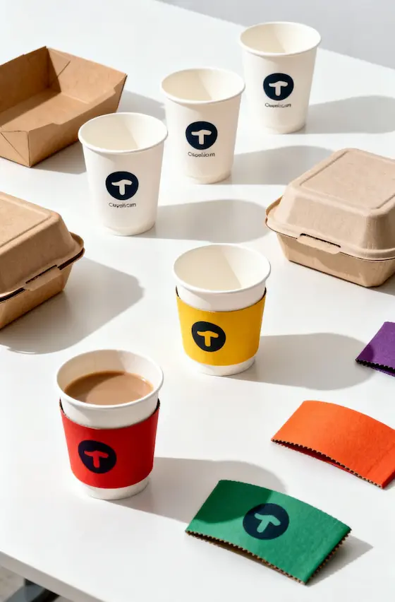
Minimal Color Palettes:
1-Color Designs (Monochrome):
•Natural kraft + black ink
•White background + single brand color
•Effect: Maximum simplicity, cost-effective
•Best for: Artisan, handmade, eco brands
2-Color Designs:
•Kraft + brand color + black text
•White + brand color + accent
•Effect: Balanced, recognizable, affordable
•Best for: Most food brands (coffee, bakery, organic)
3-Color Maximum:
•Base + brand color + accent for hierarchy
•Effect: Sophisticated, functional
•Best for: Premium products, differentiation needed
Color Meanings in Food Packaging (2025 Trends):
Natural/Kraft Brown:
•Eco-friendly, organic, unprocessed
•Authenticity, transparency
•75% of minimal food packaging uses kraft base
Black:
•Premium, sophisticated, bold
•Pairs with kraft for modern look
•Used for typography and accents
White:
•Clean, pure, clinical
•Best for health products, dairy alternatives
•Full-bleed white requires heavier paper (shows dirt easily)
Earth Tones (Terracotta, Sage, Ochre):
•Warm, natural, artisan
•Trending in 2025 for specialty foods
•Used as accent colors on kraft
Pastels (Soft Pink, Mint, Lavender):
•Gentle, approachable, health-conscious
•Popular for plant-based foods, wellness products
•Used sparingly (not minimalist if overdone)
Avoid:
•Neon or electric colors (clash with minimalism)
•More than 3 colors (visual overload)
•Gradients (add complexity, print cost)
Why Kraft:
•Unbleached = lower environmental impact
•Natural texture adds tactile quality
•Cost-effective (no coating needed)
•Universal association with sustainability
Design Approaches:
Exposed Kraft (70% kraft visible):
•Minimal ink coverage (10-30%)
•Simple logo + product name
•Example: Chipotle bags, Blue Bottle Coffee
Strategic Windows:
•Die-cut windows show product
•Reduces need for photography or illustration
•Example: Bakery boxes with circle/rectangle cutouts
Textured Kraft:
•Embossing, debossing add dimension without ink
•Raised logos, subtle patterns
•Premium feel at minimal cost increase
Printing on Kraft:
•White ink underprint for bright colors (adds cost)
•Dark colors (black, navy, forest green) pop on kraft
•Avoid light colors unless white underprint used
Cost Advantage: Kraft is 10-20% cheaper than white paper, and minimal ink reduces printing cost.
Large-Scale Type:
•Product name fills 40-60% of visible surface
•Oversized letters create visual impact
•Example: “BREAD” in 200pt covering entire bag front
Monospaced and Geometric Fonts:
•Courier, IBM Plex Mono, Space Mono
•Retro-futuristic minimalism
•Trending in tech-forward food brands (meal kits, supplements)
Variable Fonts:
•Single font with multiple weights and widths
•Allows hierarchy without multiple typefaces
•Responsive to packaging size (scales elegantly)
Type-Only Designs:
•No logos, just wordmark
•Clean, confident, memorable
•Requires strong brand name (short, unique)
Implementation:
•Limit to 10-20 words on entire package
•Every word must justify its existence
•Use type size and weight for hierarchy, not color
Packaging That Does More with Less:
Smart Structural Design:
•Self-locking tabs eliminate tape (cleaner look, faster assembly)
•Integrated handles (die-cut, not attached) reduce materials
•Flat-pack designs save shipping space and cost
•Example: Origami-style folding boxes (no glue, one piece)
Transparency Windows (Literal):
•Die-cut shapes let product show through
•Reduces need for product photography or description
•Customers see exactly what they’re buying
•Example: Coffee bags with rectangular window showing beans
QR Codes Replace Text:
•Minimal front design, QR links to full info (story, sourcing, recipes)
•Saves space, provides unlimited detail digitally
•60% of consumers under 35 scan food QR codes (2024 data)
•Design tip: Integrate QR into design (not slapped-on afterthought)
Reusable/Refillable Packaging:
•Premium boxes customers keep and reuse
•Encourages brand loyalty, reduces waste
•Minimalist aesthetic = keeps attractive on shelf
•Example: Glass jars with minimal labels (remove label, reuse jar)
 FSC certification and natural kraft materials” style=”border-radius: 8px; box-shadow: 0 2px 8px rgba(0,0,0,0.08);”/>
Materials Leading Design (2025):
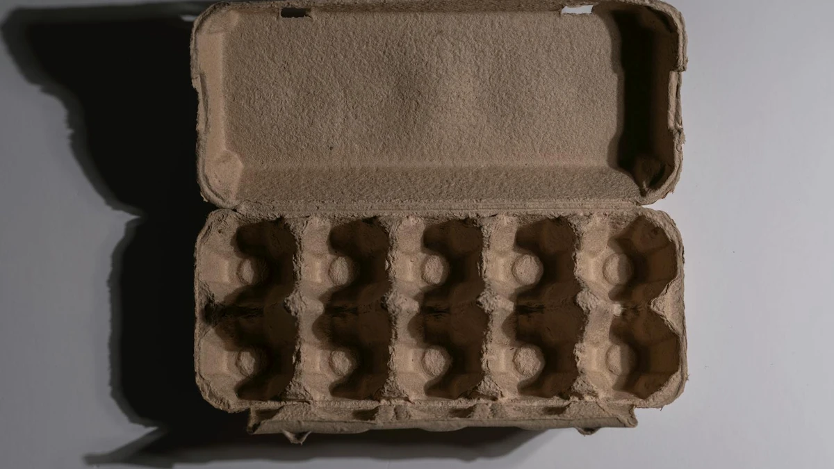
Molded Fiber (Pulp packaging):
•Made from recycled paper, bagasse, or bamboo
•Natural texture is the design
•No printing needed (emboss brand name)
•Example: Compostable coffee cup carriers, egg cartons styled for retail
Mushroom Packaging (Mycelium):
•Grown, not manufactured (low carbon)
•Unique organic texture
•Emerging for premium products (limited availability, high cost)
•Trending for luxury food gifts
Recycled Paper with Visible Fibers:
•Flecks and imperfections celebrated, not hidden
•Signals authenticity and recycled content
•Darker colors (gray, brown) show texture best
Seed Paper:
•Embedded with seeds, plantable after use
•Novelty + sustainability = marketing value
•Higher cost ($0.20-0.40 per sheet vs $0.05 standard)
•Best for: Premium products, gift items, limited editions
Design Approach:
•Let material be the star (minimal printing)
•Natural imperfections = authenticity
•Avoid covering beautiful materials with excessive ink
Intentional Emptiness:
•50-70% of package surface is blank
•Creates premium perception (opposite of cheap clutter)
•Customers’ eyes drawn to remaining elements
Off-Center Composition:
•Logo/text clustered in one area (top-left, bottom-right)
•Asymmetry creates visual interest
•Remaining 60-80% is blank
Breathing Room:
•Minimum 1 inch margin from all edges
•Elements don’t compete for attention
•Clean, uncluttered result
Psychological Effect:
•Signals confidence (“we don’t need to shout”)
•Premium positioning (luxury uses space generously)
•Modern, sophisticated aesthetic
Implementation Tips:
•Resist urge to fill space (hardest discipline)
•Comfortable silence in design = powerful
•Test: Remove one more element. If it still works, remove it.
| Food Category | Minimal Design Approach | Key Elements | Material Preference |
|---|---|---|---|
| Coffee | Kraft base, bold typography, origin emphasis | Roast level, origin, certification icons | Kraft paper bags, matte finish |
| Bakery | White or kraft, windows for product visibility | Brand name, product type, freshness | Grease-resistant paper, windowed boxes |
| Organic/Health | Clean white or kraft, certification prominent | Organic logo, benefits, ingredient list | FSC kraft, compostable films |
| Plant-Based | Soft pastels, nature imagery minimal | “Plant-Based” clear, sustainability | Compostable materials, earth tones |
| Premium/Artisan | Black on kraft or white, serif fonts | Craftsmanship story, hand-made cues | Textured paper, embossing, ribbon |
| Fast Casual | Bold brand color, geometric shapes | Speed cues, ordering info, app QR | Durable kraft bags, simple boxes |
Natural Kraft (Elevated):
•Texture: Ribbed or linen-finish kraft (not smooth standard)
•Weight: 120-140gsm feels substantial
•Printing: 1-2 colors max, minimal coverage
•Effect: Handcrafted, authentic, eco-conscious
Recycled Paper (Visible Quality):
•Don’t hide recycled content – showcase it
•Light flecking and texture = proof of recycled content
•Print: “Made from 100% recycled paper” prominently
•Effect: Transparent sustainability
Compostable Films (PLA):
•Clear windows on kraft boxes
•Matte finish (not glossy = more natural appearance)
•Print compostability instructions on film
•Effect: Functional sustainability
Minimizing Ink (Real Impact):
•Less ink = lower environmental impact (fewer chemicals)
•Unprinted surfaces = easier recycling
•Spot colors instead of full CMYK (less ink used)
•Cost savings: 20-40% less printing cost
FSC Logo:
•Placement: Bottom corner (not primary design element)
•Size: 10-15mm (minimum per FSC guidelines)
•Don’t let certification overwhelm design
BPI Compostable:
•Integrate into disposal instructions (“Compost me!”)
•Pair with icon (green bin symbol)
•Size: Small but readable (8-12mm)
Organic/Non-GMO:
•Use official logos (USDA Organic, Non-GMO Project)
•Placement: Below brand name or on back panel
•Avoid creating “badge wall” (looks cluttered)
Design Tip: Group certifications together in one area (e.g., bottom-right corner) rather than scattered across package.
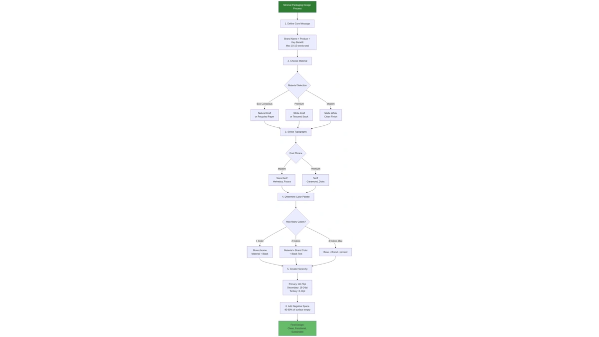
Alt Text: Minimal packaging design process flowchart from concept to final execution
Filename: blog_012_mermaid_01.png
Problem: Removing too much, leaving no personality
Solution:
•Keep one distinctive element (unique font, brand color, texture)
•Tell story through material choice (kraft = eco, white = pure)
•Typography can carry personality (geometric = modern, serif = traditional)
Example: Patagonia Provisions uses kraft + bold sans-serif + one accent color = minimal but distinctive.
Problem: Ultra-thin fonts, low contrast, too small sizing
Solution:
•Minimum weights: Regular for body, Medium/Bold for headers
•High contrast: Dark on light or light on dark (no gray on gray)
•Test legibility from 3 feet away (shelf distance)
Reality Check: If your 60-year-old parent can’t read it easily, it’s too small or thin.
Problem: Minimalism conflicts with legally required text (nutrition facts, ingredients, warnings)
Solution:
•Back panel for regulatory info (keeps front clean)
•Secondary panels for detailed content
•Front panel: Brand + product + key claim only
•Use smallest legal font size (8pt) for fine print
Legal Minimums (US):
•Nutrition facts: Specified format, size based on package size
•Ingredients: Listed in descending order by weight
•Allergen warnings: Clear and prominent
•Net weight: Specified size based on package
Design Around It: Accept regulatory text exists, design front panel to be minimal, accept back panel is functional.
Problem: Design looks great on screen, poor in hand
Solution:
•Order physical mockups before production (fold, hold, feel)
•Test in context: On café counter, in customer’s hand, in bag
•Material matters: Thin paper feels cheap even with good design
•Texture adds value: Embossing, textured paper enhance minimal design
Reality: 70% of minimal designs look better digitally than physically. Always test physical samples.
Problem: So minimal customers don’t know what they’re buying
Solution:
•Product name must be clear: “Coffee” not just “Morning Ritual”
•Category visible: “Organic Coffee Beans” more clear than “Premium Roast”
•Key details accessible: Size, quantity, main ingredient
•Transparency window: Shows product directly (eliminates guesswork)
Test: Show packaging to someone unfamiliar with your brand. Can they identify the product in 3 seconds? If no, add clarity.
Approach:
•Natural kraft bags
•Simple blue circle logo
•Bold sans-serif product names
•Minimal text (roast date, origin, roast level)
•60-70% negative space
Why It Works:
•Premium perception despite kraft material
•Clear product identification
•Sustainability signaled through material choice
•Typography hierarchy guides eye (product name → origin → roast date)
Cost Efficiency: 2-color printing on kraft = low production cost passed to customer as value
Approach:
•Clean white cartons
•Bold black typography
•Playful copy in minimal space
•No images, just words
•Humorous text breaks minimalist stereotype
Why It Works:
•Distinctive in dairy aisle (competitors use photos)
•Typography = brand personality (quirky, confident)
•White base = pure, clean product perception
•Minimal cost, maximum impact
Lesson: Minimalism doesn’t mean boring – personality through copy and typography.
Approach:
•Brown kraft bags
•Simple logo + tagline
•Hand-drawn style illustrations (minimal, not photo-realistic)
•1-2 colors max
•Large areas of exposed kraft
Why It Works:
•Sustainability signaled (kraft = eco-friendly)
•Fast-casual positioning (not fancy, not cheap)
•Hand-drawn style = authentic, not corporate
•Cost-effective at scale (billions of bags annually)
Lesson: Minimalism works for high-volume operations (cost + sustainability).
Often YES, if designed correctly:
Cost Savings:
•Fewer colors = lower printing cost (1-2 colors vs full CMYK)
•Less ink coverage = less ink used (20-40% reduction)
•Kraft paper = 10-20% cheaper than white
•Simpler designs = faster production, less waste
Example:
•Full-color printed white bag: $0.15-0.20
•2-color kraft bag: $0.10-0.14
•Savings: 25-40% per unit
Exceptions:
•Embossing, debossing add cost (+$0.02-0.05 per unit)
•Specialty papers (textured, heavy weight) cost more
•Die-cut windows add tooling cost ($500-1,000 setup)
Bottom line: Simple minimal designs reduce printing cost, but premium materials may offset savings.
NO, if designed well:
Premium Perception Factors:
•Material quality: 120gsm+ paper feels substantial
•Texture: Matte, textured finishes = premium (not glossy or thin)
•Execution: Clean, precise printing (no misalignment)
•Negative space: Generous empty space = confidence, luxury
Cheap-Looking Minimal:
•Thin paper (under 100gsm)
•Poor print quality (blurry, off-center)
•Generic fonts (Arial, Times New Roman)
•No hierarchy (everything same size)
Comparison:
•Apple packaging: Minimal + premium materials + precise execution = luxury
•No-name generic: Minimal + cheap materials + poor execution = low quality
Key: Material quality and execution matter more than design complexity.
Differentiation Strategies:
Unique Typography:
•Custom font or distinctive typeface pairing
•Oversized type that dominates package
•Example: Glossier’s unique sans-serif wordmark
Distinctive Color:
•Own one color in your category
•Example: Tiffany blue, Cadbury purple
•Use consistently across all packaging
Signature Material:
•Unusual substrate (seed paper, molded fiber, textured stock)
•Consistent material = brand recognition
Brand Voice:
•Copy tone unique to your brand
•Example: Oatly’s quirky voice vs competitors’ boring text
Structural Innovation:
•Unique shape or opening mechanism
•Example: Toblerone’s triangular prism (minimal label, iconic shape)
Reality: Minimalism forces you to differentiate through essentials (color, type, material) not decoration.
Generally NO (photos contradict minimalism)
Exceptions:
•Single hero image: One high-quality photo, ample negative space around it
•Example: Premium chocolate bar with single cacao pod photo
•Avoid: Multiple photos, photo collages, busy backgrounds
Better Alternatives:
•Transparency window: Show actual product (more honest than photo)
•Simple illustration: Line drawing or icon (less visual weight)
•Type-only: Describe product with words (clean, minimal)
When Photos Work:
•Luxury products (single product shot, generous white space)
•Premium positioning (photography = quality)
•But even then: Minimal post-processing, clean backgrounds
Rule: If adding photo, maintain 50%+ negative space and limit to one image.
Minimal (Intentional):
•Every element serves purpose
•Clear hierarchy (eye guided intentionally)
•Personality through typography, color, or material
•Strategic restraint (could add more, chose not to)
Boring (Accidental):
•Lack of ideas, not intentional simplicity
•No hierarchy (all elements equal weight)
•Generic fonts, colors, materials
•Absence of design, not thoughtful design
Test:
•Does packaging communicate brand values? (Minimal = yes, Boring = no)
•Is there visual interest? (Minimal = yes through contrast/scale, Boring = no)
•Could someone replicate this in 5 minutes? (Minimal = no, takes skill; Boring = yes)
Example:
•Minimal: Apple packaging (intentional, distinctive, memorable)
•Boring: Plain white box with product name in Arial (generic, forgettable)
General Rule: 1-3 colors maximum
1 Color (Monochrome):
•Natural material (kraft, white) + one ink color
•Most minimal, most cost-effective
•Example: Black on kraft
•Best for: Ultra-minimalist, eco brands, artisan products
2 Colors:
•Material + brand color + black text
•Balanced, recognizable
•Example: Kraft + forest green + black
•Best for: Most food brands (coffee, bakery, organic)
3 Colors (Maximum):
•Base + brand color + accent for hierarchy or call-out
•Example: White + navy (brand) + red (accent for “New”)
•Best for: Products needing differentiation, line extensions
More Than 3 Colors:
•No longer minimal (enters standard design territory)
•Higher printing cost
•Visual complexity increases
Color Strategy: Start with 1 color, add second only if necessary for function (hierarchy, clarity), add third only if critical.
YES – minimal is often cheaper:
Why Minimal Works for Budget:
•Lower printing costs (fewer colors, less ink)
•Kraft paper cheaper than white or coated
•Simple designs faster to produce (less waste)
•No need for expensive photography or illustration
Budget Minimal Strategy:
•Natural kraft base (cheapest material)
•1-color printing (black or dark color on kraft)
•Bold typography (no images needed)
•Functionality focus (clear product info, no fluff)
Positioning:
•Frame as “honest” and “transparent” (no unnecessary decoration)
•Sustainability angle (minimal = less waste)
•Value proposition: Savings passed to customer (no fancy packaging cost)
Examples:
•Trader Joe’s (minimal design, budget prices, premium perception)
•Aldi (simple packaging, discount pricing, growing market share)
Key: Budget doesn’t mean boring – thoughtful minimal design adds value without cost.
Minimal packaging design is a discipline of intentional restraint: every element earns its place, and empty space is as important as content.
Key Takeaways:
1.Visual hierarchy is critical: Primary (brand/product), secondary (details), tertiary (fine print) guide customer attention
2.Limit colors to 1-3: Monochrome or 2-color is ideal for true minimalism and cost efficiency
3.Typography carries weight: Bold sans-serifs for modern, serifs for premium, oversized type creates impact
4.Negative space = premium: 40-60% of package surface should be empty to create breathing room
5.Material choice matters: Kraft paper dominates 2025 minimal sustainable design
6.Functional minimalism wins: QR codes, transparency windows, structural innovation add value without clutter
7.Test physically: Designs must work in hand, not just on screen
Start with less, add only what’s essential, let quality materials and typography do the work.
•Custom Printed Paper Bags – Minimal branding on sustainable bags
•Sustainable Paper Packaging – Eco materials for minimal design
•Food Packaging Containers – Full range of minimal packaging options
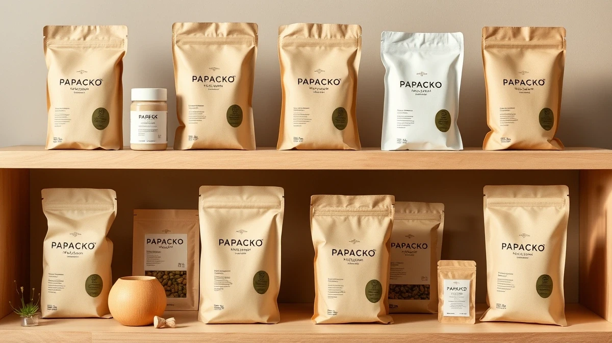
Papacko supplies FSC kraft paper packaging ideal for minimal design, with flexible printing options from 1-color to full-color.
Why choose Papacko:
•Kraft paper specialists: Natural, textured, and recycled kraft options
•Low MOQ printing: Digital printing from 5,000 units for testing minimal designs
•Design consultation: We help optimize minimal designs for production
•Sustainable materials: FSC-certified, compostable films, recycled content
•Embossing/debossing: Add texture to minimal designs without ink
•Sample kits: Test paper weights and textures before committing
Minimal design only works when print methods, structural packaging choices, and the commercial product range all support the same restrained visual system.
Get in touch:
•Request a Quote – Kraft packaging with minimal printing options
•Free Design Consultation – Optimize your minimal design for cost and impact
•Sample Kit – Feel paper quality and finishes in person