Prêt à créer vos propres gobelets ou emballages en papier ?
Faites-nous part de vos exigences - taille, revêtement, impression et destination - et notre équipe établira un devis détaillé dans les 24 heures.

Branded takeaway cups are both a service component and a highly visible brand touchpoint. They need to suit the drinks, lids, dispensing routine and waste system used by a venue, while the artwork needs to survive a real production workflow from design file to delivered stock. That makes a branded cup project more than a logo-placement exercise. It is a procurement decision involving product specification, artwork control, supplier communication, sampling and a rollout plan.
This guide is for foodservice operators, purchasing teams and brand teams evaluating a branded cup program. It does not treat a generic cup, printing method or material description as proof of performance. The useful decision point is the exact SKU, its current supplier documentation and a representative sample used in the intended service environment.
Treat branded takeaway cups as a controlled product-and-artwork project. Define the exact cup and lid system first, use the supplier’s current production template, approve a representative sample, involve operations in handling checks and retain the approved SKU and artwork version for every reorder.
A cup can look simple on a presentation board but still be part of a multi-component service system. The cup body, rim, lid, sleeve where used, carrier, drink recipe, fill level and handoff routine all affect what staff and customers experience. A design that works on an isolated cup rendering may be difficult to read once a lid, sleeve or a customer’s hand covers the relevant area.
Start by defining the job the cup must do. Clarify which drinks it will hold, whether it will be used for hot, cold or mixed service, which cup sizes are in scope, whether existing lids remain in use, and how the cups are stored and dispensed. Then decide whether the goal is a brand refresh, a campaign, a seasonal program, a location launch or a long-running core SKU. These choices influence order timing, approval controls and the risk of carrying obsolete stock.
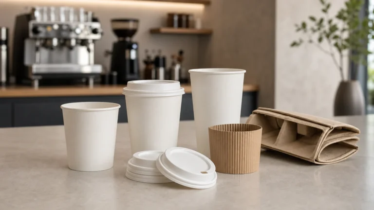
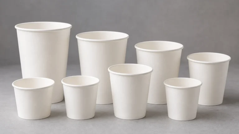
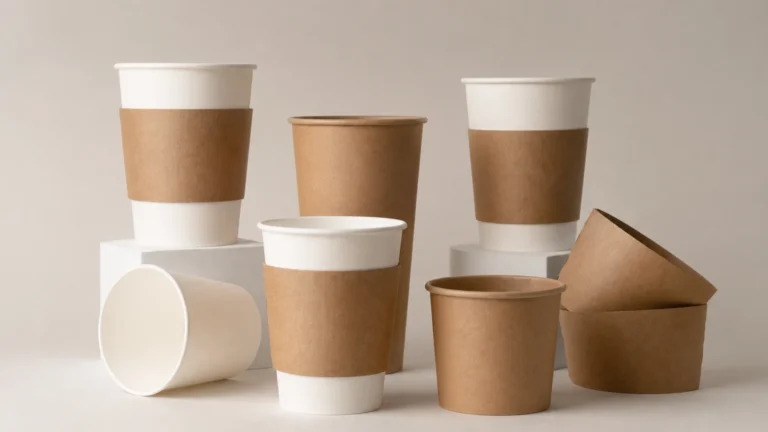
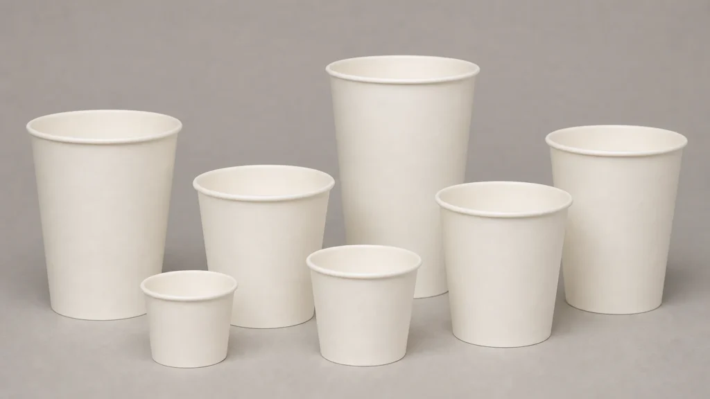
For a general starting point, review the available gobelets en papier as formats rather than assuming every listed option is interchangeable. The appropriate final choice still depends on the exact cup construction, intended beverage and corresponding components.
The artwork brief should follow the product brief, not replace it. Before a designer begins final production files, document the cup formats, proposed sizes, material family, intended beverage applications, target markets, lid relationship, packaging quantity and expected replenishment pattern. This creates a shared reference for the buyer, designer and supplier.
The specification also needs a decision owner. Brand teams can approve the appearance, but procurement and operations need a clear role in approving the SKU, supply requirements and service compatibility. If responsibility is split without a written approval path, a project can reach print sign-off before the operational questions are resolved.
Useful questions to record include:
This process prevents a common mistake: approving an attractive artwork concept that later has to be altered because the actual print area, cup taper or component fit is different from the assumption used in design.
Cup artwork normally has a curved printable surface rather than a flat rectangular panel. A supplier’s current template should therefore be the source for dieline, bleed, safety area, seam position and any areas that should remain clear. Do not reuse an old template merely because the overall cup size name sounds unchanged; an exact product or production setup can change.
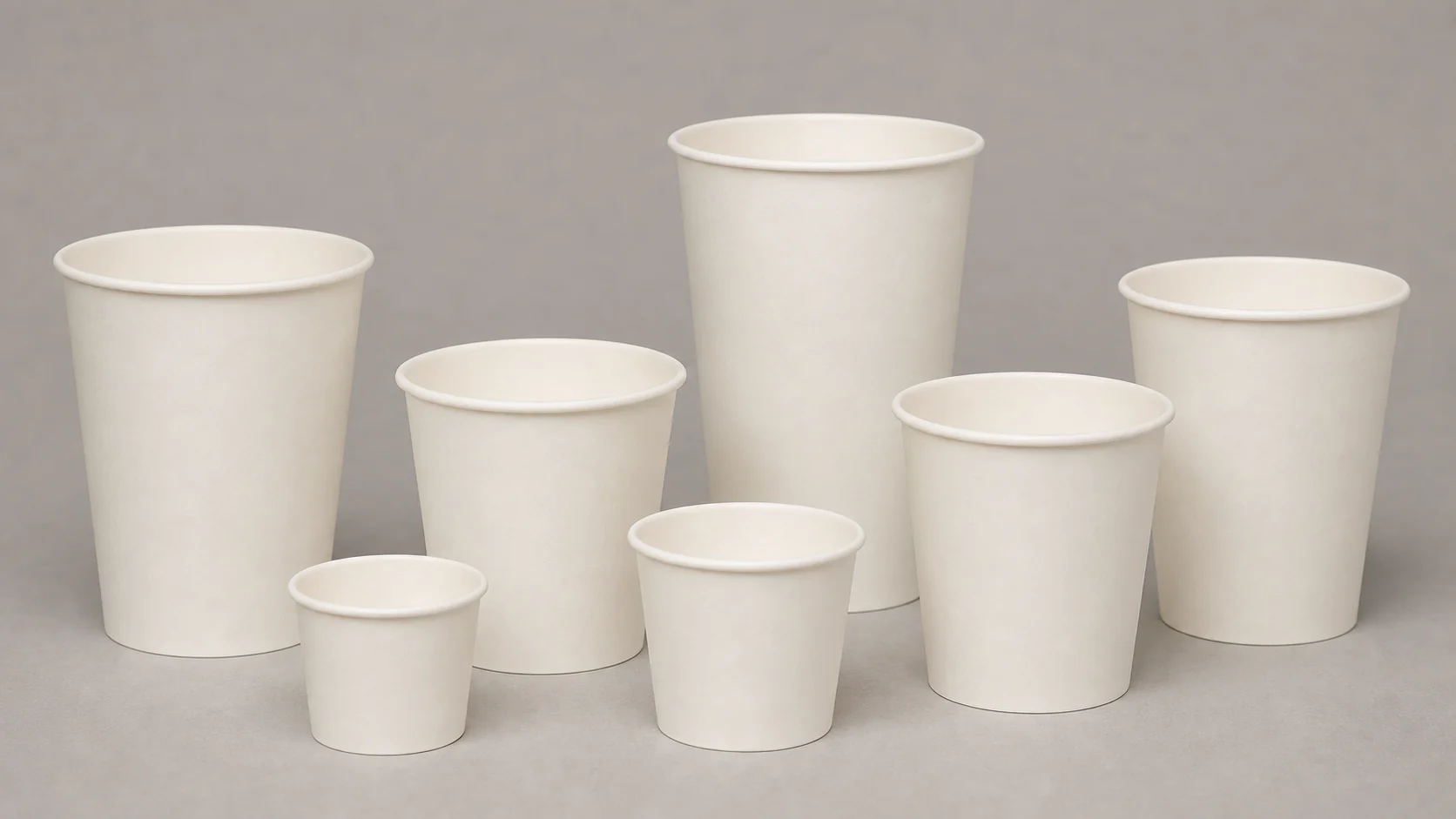
Ask the supplier for the current production template and establish the file format, linked-image requirements, font handling, colour reference process and proof route before artwork is considered final. Keep one controlled source file and a versioned PDF proof in the project record. A clear filename and version date are small disciplines that can avoid expensive uncertainty later.
Designers should consider the practical viewing conditions. A cup is often seen while held at an angle, behind a lid, in a busy counter setting or briefly in a photograph. Fine lines, small legal copy, low-contrast colour combinations and artwork placed close to a seam can become less useful than they appeared on screen. These are design risks to review with a physical proof, not universal rules about what a print process can or cannot achieve.
For coffee-led service, reviewing tasses à café alongside the intended lid format can help the team frame the system decision. It does not remove the need to confirm the exact rim, lid and cup combination.
Colour is one of the most sensitive parts of a branded cup rollout because brand standards often originate in digital or coated-paper design environments. The final appearance on a cup can be influenced by the selected substrate, surface treatment, artwork coverage, ink system, production process, lighting and viewing conditions. A screen image alone cannot establish the final result.
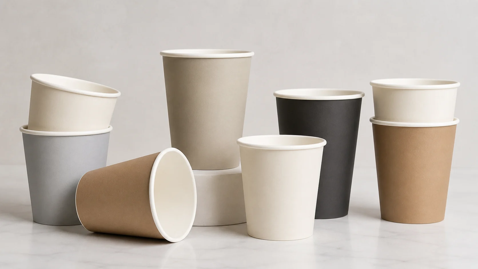
Define how colour will be reviewed before making an order. That can include the supplied colour references, the production proof route, the reviewer, the review conditions and what constitutes an approved sample. Where a campaign has a highly sensitive colour or large coverage area, involve the supplier early instead of assuming an ordinary proof will answer all brand questions.
Avoid describing a finish as automatically premium, durable or colour-accurate. Those descriptions need to be tied to a particular product and production method. The appropriate question is whether the representative sample meets the project’s approved visual standard and service requirements.
Material and finish affect more than the look of a cup. They can influence hand feel, print appearance, storage behaviour, use with hot or cold beverages and the documentation a buyer needs. The right choice depends on the actual use case and the supplier’s exact specification.
The same applies to environmental language. Terms such as recyclable, compostable, plastic-free or sustainable should not be copied into artwork or marketing without checking the specific product, the intended market and the waste collection route available to the customer. A material claim that is technically meaningful in one collection system may be misleading in another.
For US food-contact applications, the Cadre réglementaire de la FDA relatif aux substances en contact avec les aliments is a useful starting point for understanding the regulatory context. It is not a substitute for obtaining the documentation relevant to the exact cup, ink, coating and intended use from the supplier, nor for checking the requirements of the market where the product will be used.
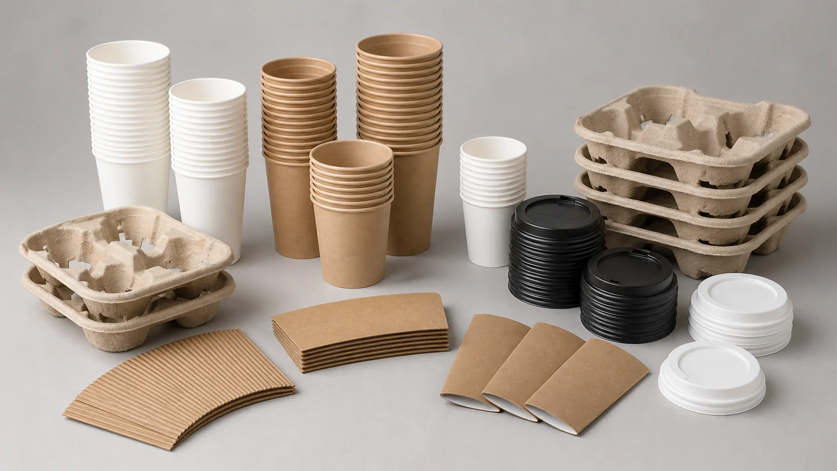
A branded cup has to work after printing, not just before it. Verify the cup with the exact lid, and where relevant with a sleeve or carrier. Lid fit, application force, stackability, drink handoff and storage access all affect a busy service line. A separate component can also cover a large portion of the printed cup, which matters when deciding where key brand elements should sit.
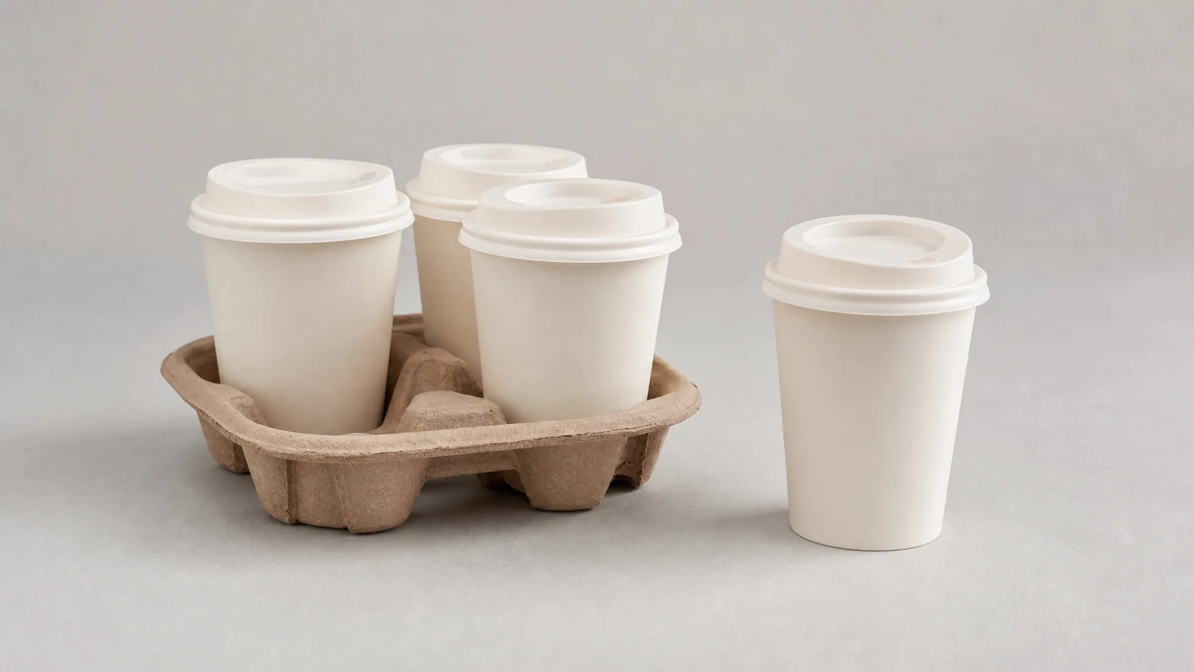
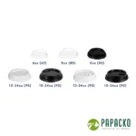
Review couvercles de gobelets en papier as part of the component relationship, then confirm fit against the named cup SKU. Do not infer compatibility from a generic size label or a product photograph. Operations staff should handle the selected components during a normal service simulation, using the actual drinks and fill routine where practical.
A representative sample is the bridge between a design decision and a purchasing decision. It lets the team review artwork placement, visible seams, finish, legibility, cup-to-lid relationship and basic handling in the context where the cup will be used. Record what was reviewed, which sample version was approved, and which product identifiers and artwork revision it represented.
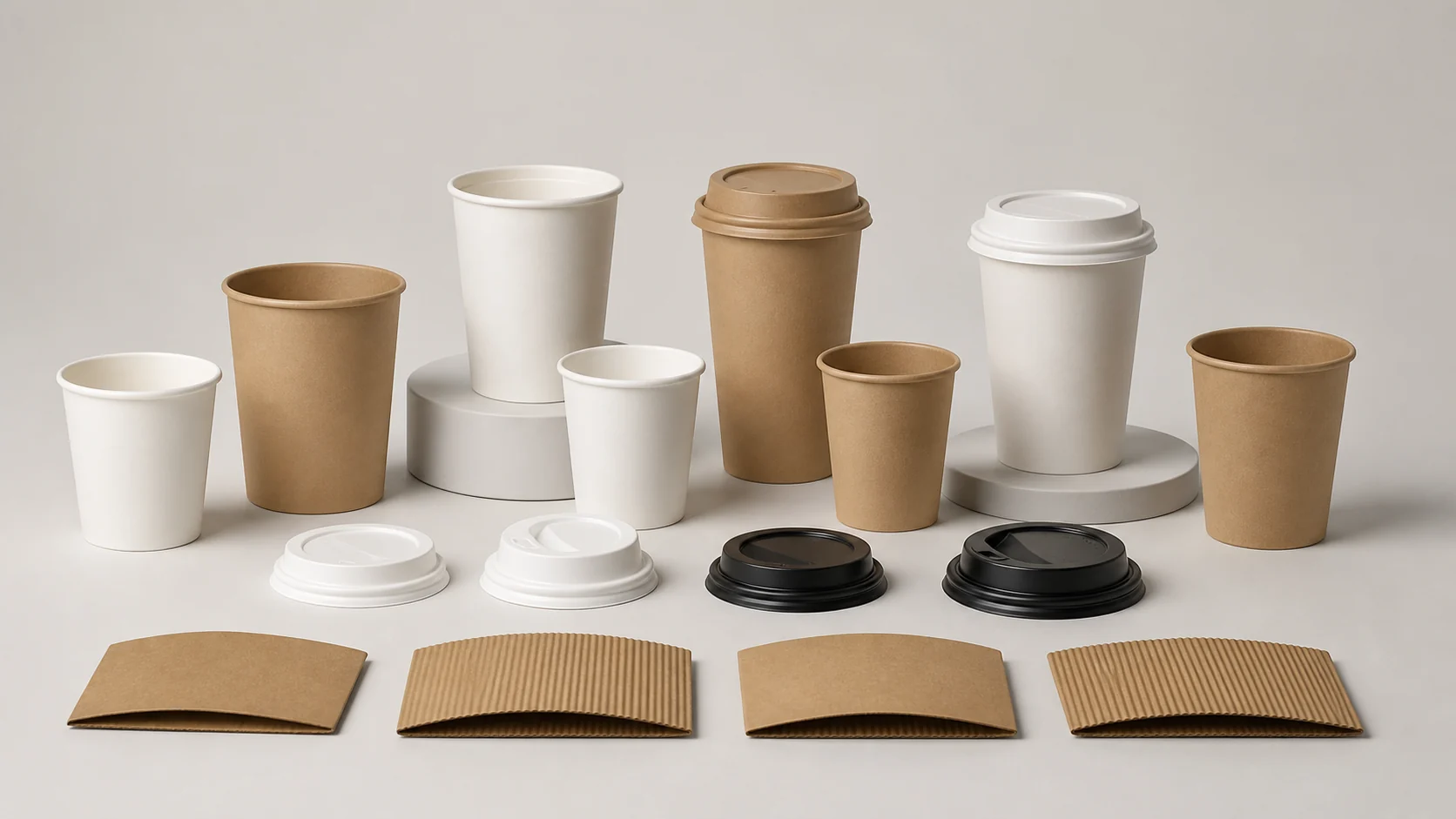
The sample review should not turn into unsupported performance claims. Instead, use it to identify questions that need supplier confirmation or a further test. Examples include whether a cup works with a particular beverage recipe, whether a lid applies consistently, whether a colour is acceptable to the brand team, and whether the chosen pack quantity works with the venue’s storage.
Before a volume release, create a straightforward checklist:
A phased rollout gives a team time to identify operational issues before every location or channel is committed. The phase can be a single location, selected stores, a limited campaign period or a controlled first delivery. The right scale depends on stock risk, supplier lead times and the cost of holding duplicate packaging.
During the phase, collect feedback from people who unload cartons, replenish dispensers, apply lids and hand drinks to customers. Their observations can expose an issue that a design review would not see, such as a confusing pack label, a storage mismatch or a branded area that is routinely hidden in use. Capture the feedback against the exact SKU and artwork version so it can inform a clear release decision.
For a wider packaging program, emballages alimentaires jetables et emballages pour plats à emporter should be considered alongside cups when the same brand system spans food containers, bags and drink service. Consistency is useful, but every product still needs its own specification and approval evidence.
The first production run is not the final control point. Keep the approved artwork, supplier specifications, documentation and sample record accessible to the people who manage reorders. Re-approval is sensible when the cup SKU, supplier, material, coating, print process, lid system, artwork, market or service application changes.
It is also worth reviewing the project when a brand refresh, new location, waste-policy change or recurring quality concern changes the original assumptions. A simple re-approval trigger prevents a prior sample from being treated as permanent evidence for a product that is no longer identical.
Branded cup projects often involve several teams with different success measures: a brand team sees a customer-facing asset, operations sees a service component and procurement sees a repeat-purchase SKU. The practical value of a controlled brief, sample record and rollout checklist is that it connects those views before a volume order is released.
Specific material, print, colour and food-contact conclusions require evidence for the exact product. Supplier documentation and representative production samples are the primary sources for those decisions. The FDA food-contact framework provides useful US context, while local legal and compliance requirements may require additional review.
Use this guide to create a project record before artwork is finalized. Define the exact cup system, obtain the current template, set the colour-proof process, approve a representative sample, involve operations, and keep the approved version attached to every reorder. If a material or process changes, repeat the relevant approval steps rather than relying on prior assumptions.
Include the exact cup SKU, intended drink use, current supplier template, related lids or accessories, artwork owner, approval owners, delivery objective and the documentation required for the intended market.
No. A mockup is useful for design discussion, but final appearance should be reviewed through the agreed proof process and a representative sample for the exact product.
No. Review the cup and lid together before approval because fit, handling and the area covered by the lid can affect both service and artwork visibility.
Review the exact SKU, artwork version, placement, legibility, finish, cup-to-lid relationship and any documentation or operational questions identified in the project brief.
Use a controlled phase, align the remaining old stock with the launch plan, record staff feedback, and only expand after the named reviewers approve the final component system.
Repeat the relevant review whenever the SKU, supplier, material, print process, artwork, lid system, market requirement or intended service condition changes.